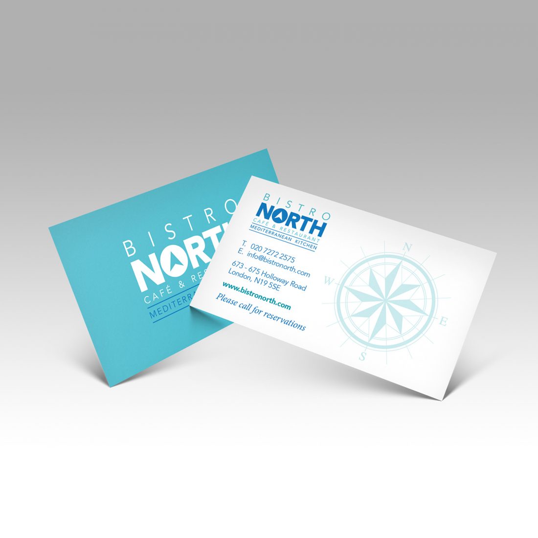
Five Top Tips to Help Your Business Card Stand Out
Everyone should have a business card – even in these days of internet and social media advertising. After all, what other marketing tool is as simple, personal and effective?
Absolute Print are a leading business card print company based in Islington. We believe it’s well worth your while investing in a professional, well-designed and printed business card. Here we have come up with a few key pointers to ensure you really are playing your cards right.
Choose Your Typeface Carefully…
You want to use a typeface or font that reflects the nature of your business accurately. You could choose a serif font, which has decorative lines or tapers added to the stems of letters. Times New Roman, Garamond and Courier New are among the most popular serif variants and will give your card more of an artistic feel. They also work well if you are selling a more traditional product.
A sans serif typeface, such as Arial, Helvetica or Calibri produces simple, clean lines where the text is the same width throughout and doesn’t have any of serif decorative strokes. Sans serif fonts work well for businesses which are looking to promote a modern or contemporary look.
It’s also worth noting that serif fonts are more readable in smaller sizes, so are ideal for the body text you might get in a business address, while sans serif typefaces really stand out in larger sizes, such as main headings.
…and Your Shape
Most business cards are rectangular – this is a tried and trusted format and a shape which will easily fit into someone’s wallet or purse.
However, if you are prepared to take a risk, why not go for a slightly different shape, such as a square or rounded card? Or something more subtle, such as a rectangular card but with rounded corners? These choices will certainly ensure that you and your business will stand out.
Don’t Over-Clutter the Front
Remember that too much information can be hard on the eyes and dilute the effectiveness of the key details. So, leave plenty of white space on the front and don’t put too much text on the card.
Make sure the key details, such as your name, job title, and the name of your business, are distinctive. This can be achieved by using a bold typeface, or a larger sans serif font, so they really stand out.
Use the Back Too
A business card has two sides, not just one – so use the back as well, otherwise you are effectively wasting half the space. Given that the key details will be on the front, you can be a bit more creative on the reverse of the card; include the company logo if it isn’t already on the front, or details of a special offer which can be activated by the production of the card.
Include a Call to Action
To be truly effective, all business cards should incorporate a call to action. The most effective way of achieving this is through a QR code, which are now increasingly common in the commercial world. Scanning the code could direct the card owner to your company website, subscribe them to your mailing list, or entitle them to a discount or special promotion. The QR code should go on the back of the card so it won’t detract from any of the key information on the front.
Absolute Print – A Business Card Design Company from Islington
If you are still unsure about how to get the most out of your business cards, then Absolute Print can design as well as print them. We can help with other types of printing too – we are also a banner and brochure design company, with clients in Archway, Holloway and across North London.
If you would like to know more about any of our services, click on this link and fill in the online form or call us on 020 7272 2224.


No Comments